Data, Health & Biology
It’s not the size of your data, it’s how you use it
Michael Lydeamore
Department of Econometrics and Business Statistics
My Roadmap
- Bachelor of Mathematical Sciences at the University of Adelaide (completed 2012)
- Masters of Philosophy at the University of Adelaide (completed 2015)
- PhD at the University of Melbourne (completed 2019)
- Joined Monash University in mid-2019
- Including honorary position at the SaferCare Victoria, Department of Health & Human Services
- Recruited into the COVID-19 response in late February/early March
- Appointed Manager of Analytics in September
- Rejoined Monash in 2021, including the Doherty COVID-19 Modelling Consortium
- Joined EBS in September 2021
Burden of Healthcare Associated Infections in Australia
Joint work with Brett Mitchell, Tracey Bucknall, Allen Cheng, Phil Russo & Andrew Stewardson
Healthcare asociated infections
Healthcare associated infections (HAIs) are associated with increased morbidity and mortality.
Five of the most common HAIs are:
- Clostridiodes difficile — causes severe damage to the colon, can be fatal
- Bloodstream infection (sepsis) — estimated mortality rate of 15-30%
- Urinary track infection — low mortality but associated with multi-drug resistance and significantly longer stays
- Healthcare acquired pneumonia — mortality rate of 40-70%, increasing dramatically with age
- Surgical site infection — significantly increases length of stay
But, HAIs are not notifiable => We have no robust way to track whether their prevalence is increasing or decreasing.
Overseas monitoring
HAIs are actively monitored across Europe through the ECDC.
In 2016 (based on 2012 data), 2,609,911 new HAIs are estimated to have occurred.
The data for this was a point prevalence survey, on an enormous scale:
- 273,753 patients
- 1,149 hospitals
Point prevalence survey
A point prevalence survey counts the number of people with a condition on a given day.
We ran a PPS in Australia in 2019, consisting of:
- Adults in 19 large acute care public hospitals
All acute cards wards were included. Non-acute, paediatric, NICU, rehab, and ED were excluded.
The hospitals sampled make up approximately 60% of all overnight separations in Australia.
Point prevalence survey
- 2767 patients sampled between 6 Aug and 29 Nov 2018
- Median age: 67 (range 18-104)
- 52.9% male, 46.6% female, 0.5% unknown/other
- 85.7% patients in major city hospitals
Methodology time
We have to go from point prevalence to annual incidence…
Estimation methodology
Step 1: Estimation of hospital prevalence
Hospital Prevalence (\(P\)) is estimated as:
\[P = r \times \text{Beta}(n_\text{obs}, N - n_\text{obs}+1) + (1-r) \times \text{Beta}(n_\text{obs}+1, N-n_\text{obs}),\]
where \(n_\text{obs}\) is the number of patients observed with a HAI and \(N\) is the total number of patients in the PPS.
This is a standard extrapolation from a binomial sample with a lot of zeros.
Estimation methodology
Step 2: Estimation of hospital incidence
Hospital incidence (\(I\)) calculated as:
\[I = P \frac{LA}{LOI},\]
where:
- \(P\) is the hospital prevalence from Step 1
- \(LA\) is the mean length of stay and
- \(LOI\) is the length of infection
🎉🎉 Australia actually captures \(LA\) through the AIHW 🎉🎉
Estimation methodology
Step 2a: Length of infection
\(LOI\) is not available, but instead we have \(LOI_{pps}\) — the length of infection until the date of survey. We can calculate
\[P(LOI_{pps} = 1),\]
which is just the probability that a patient is in the first day of their HAI. Then,
\[E[LOI] = 1/P(LOI_{pps} = 1).\]
For a small sample size, this is heavily biased, so we take a mixture of this estimator and \(E[LOI_{pps}]\).
Estimation methodology
Step 3: Estimation of population incidence
Calculate population incidence simply as
\[I_\text{pop} = I \times N_\text{discharges}.\]
🎉🎉 We capture this too! \(N_\text{discharges} = 3,713,513,\) 60% of the total admissions in a given year.
In the ECDC PPS, this quantity is not captured. They estimate using patient-days and the number of patients.
Estimation methodology
Step 4: Stratification by age and sex
Use a multinomial likelihood function with a Dirichlet prior, with weights taken from the number of cases in each age/sex category.
A psuedocount is added to each strata (\(0.001 \sum{\text{weights}}\)) to ensure the likelihood can be calculated with empty strata.
Just because it’s called \(w\) doesn’t make it a weight
L. Kennedy
But for today it is a weight. We’ll survive.
Estimation methodology
Step 5: Adjustment for life expectancy
Use the “McCabe score”, which gives the life expectancy according to secerity of a disease.
Patients are categorised as:
- non-fatal
- fatal (average life expectancy of 3 years)
- rapidly fatal (average life expectancy of 0.5 years)
These scores, combined with disease outcome trees, give DALYs and deaths.
Disease outcome trees
Key results
| Number of HAIs (95% CI) |
Deaths (95% CI) |
DALYs (95% CI) |
|
|---|---|---|---|
| SSI | 44,238 (31,176 - 73,797) |
876 (617 - 1,263) |
13,197 (9,298 - 19,001) |
| UTI | 42,408 (25,200 - 68,735) |
729 (259 - 1,772) |
16,087 (5,939 - 37,218) |
| CDI | 5,125 (2,360 - 10,740) |
262 (13 - 836) |
2,757 (241 - 8,655) |
| HAP | 51,499 (31,343 - 82,877) |
1,904 (462 - 4,430) |
39,276 (17,608 - 77,915) |
| BSI | 23,979 (15,658 - 36,245) |
3,512 (1,874 - 6,075) |
46,773 (26,205 - 79,104) |
| All | 170,574 (135,779 - 213,898) |
7,583 (4,941 - 11,135) |
122,376 (85,136 - 172,784) |
That’s 1 in 20 admissions resulting in an avoidable infection!
Key results
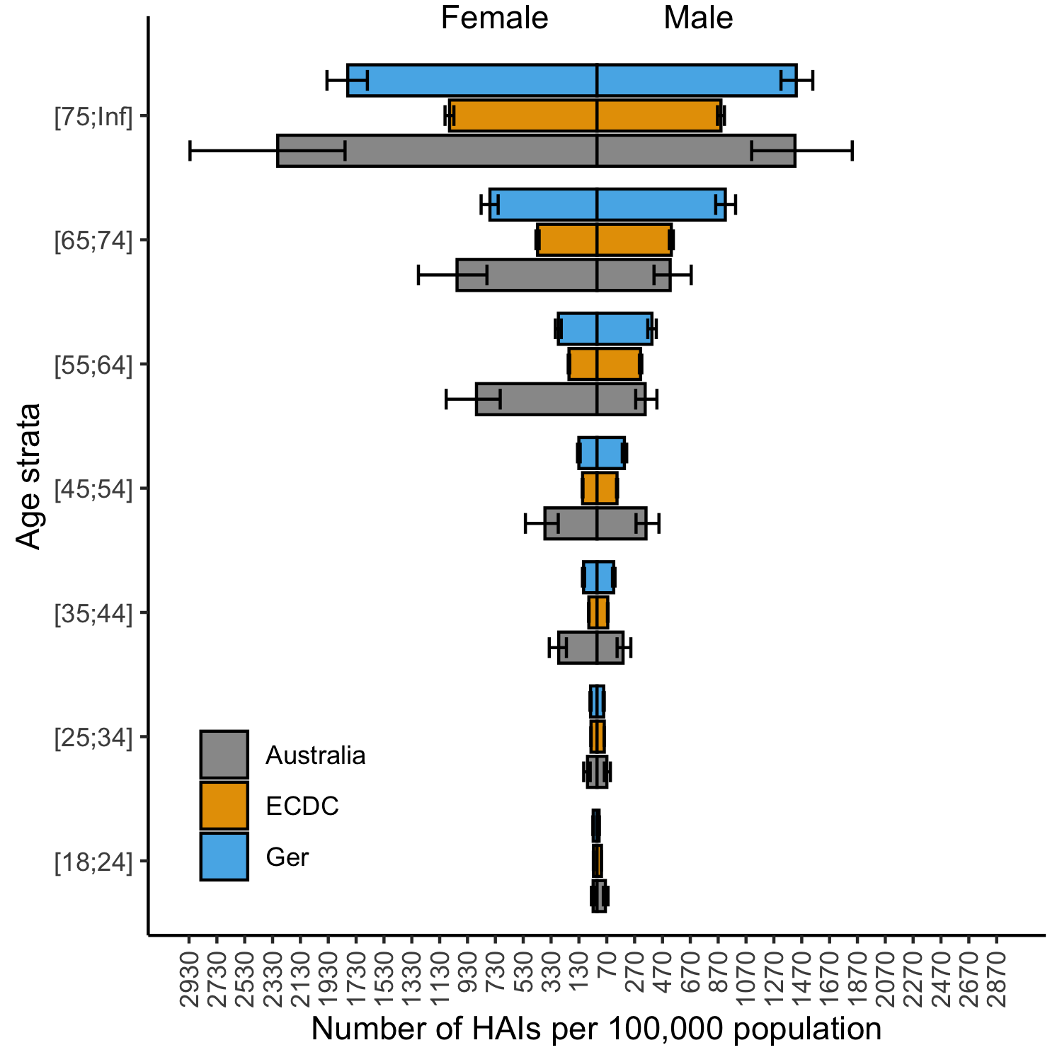

Key results
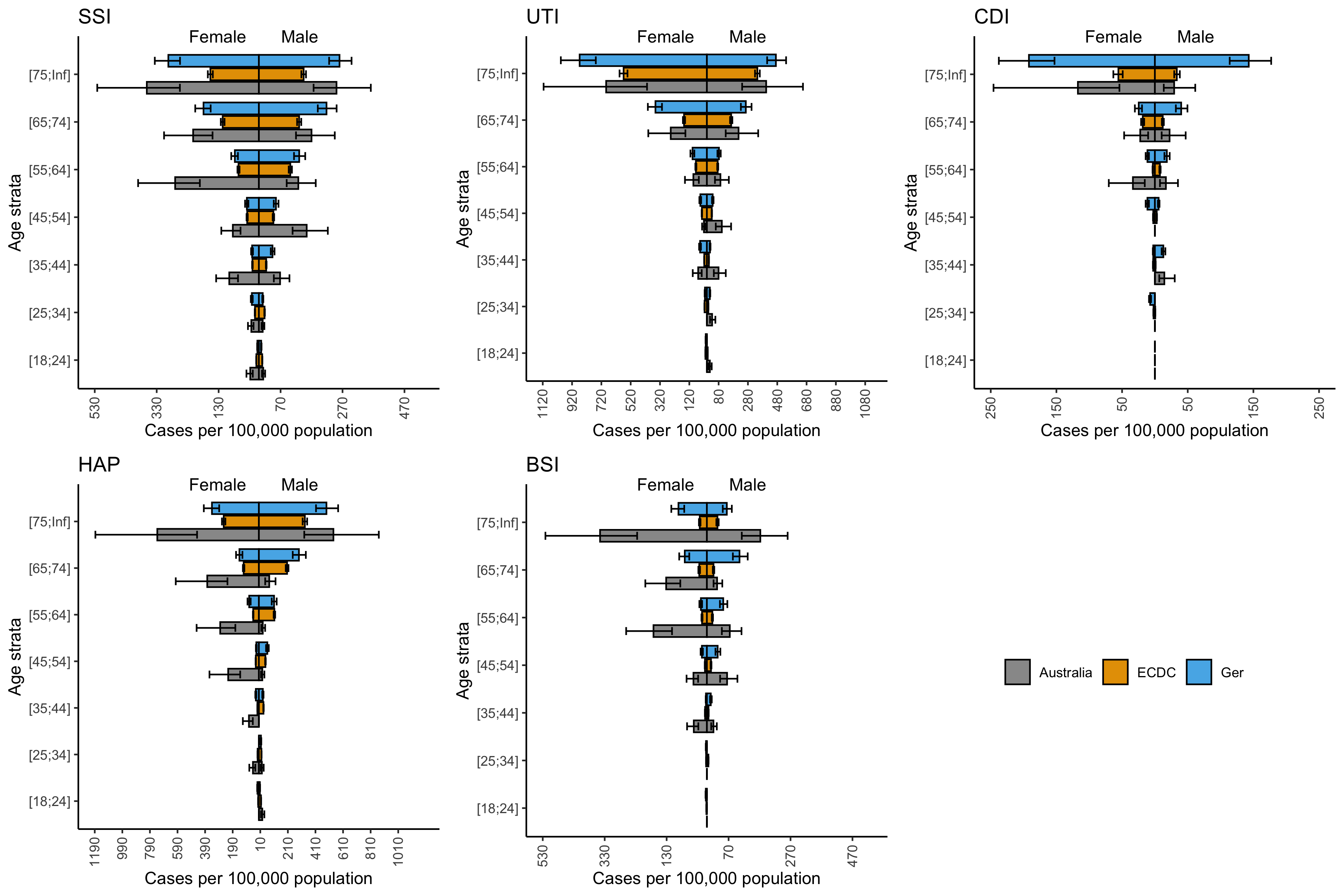
Key results
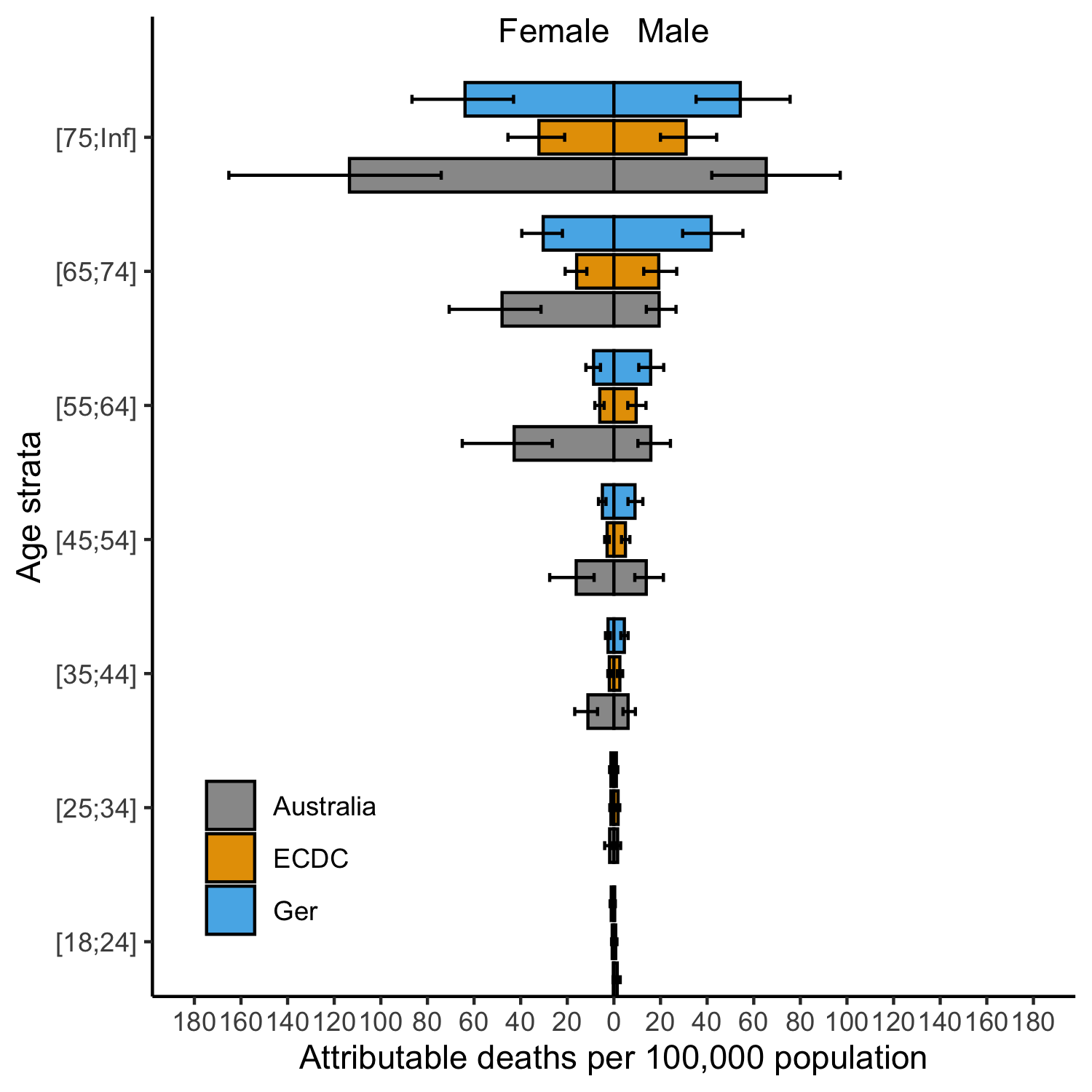
Novelty
First estimate of HAI burden in Australia using (relatively) robust survey data in an established framework
Based on first point prevalence survey since 1984
There is no routine surveillance of HAIs in Australia
Point prevalence surveys remain the only way to understand the burden of these conditions
Summary
- 498 DALYs per 100,000 is a large amount
- Motor vehicles: 180 DALYs
- Infectious diseases: 370 DALYs
- Respiratory diseases: 1380 DALYs
This work has informed guidance on HAI surveillance in Australia, including new funding schemes to better understand these conditions.
And all this based on just 2767 patients from 19 hospitals…
HAIs are largely preventable.
They represent great opportunity for improvement, and we have a long way to go to prevent them entirely.
Visualising how non-linear dimension reduction warps your data
J. Lakshika, D. Cook, P. Harrison, T. Talagala, M. Lydeamore
High dimensional data
The world collects a lot of data. Much of this data is very wide.
This “high-dimensional” data is very challenging to visualise, as we can only see in two dimensions.
One key application area is single-cell RNA data. The main task is to identify groups of cells with similar expression profiles
Data is collected on the amount of a gene expressed by a cell. Similar types of cells should express similar types of certain “marker” genes.
But how do we check?
Tours
What is a tour?
- Interactive and dynamic graphics to visualise high-dimensional data
Why is the tour technique involved?
- Tour shows a sequence of linear projections as a movie
- It involves mentally assembling multiple low-dimensional views to comprehend the structure in higher dimensions
Dimension reduction
Dimension reduction is a common way to reduce a high dimensional dataset into a lower number of dimensions.
- Linear techniques (like PCA) are classical techniques that use a linear mapping to reduce dimension
- Recent years has seen non-linear mappings that can maximise variance in a 2D view
- These mappings aim to preserve pairwise distances from high dimensions into lower dimensions
- Common tools include: uMAP, tSNE, PACMAP and more recently, PHATE.
As with anything designed to maximise variance, it is important to check these techniques aren’t inventing structures.
Dimension reduction
Formally speaking, the problem can be specified as:
Consider the High-D data a rectangular matrix \(X_{n\times p}\), with \(n\) observations and \(p\) dimensions.
We aim to discover a projection \(Y_{n \times d}\), i.e. an \(n \times d\) matrix with \(d \ll p\).
An example
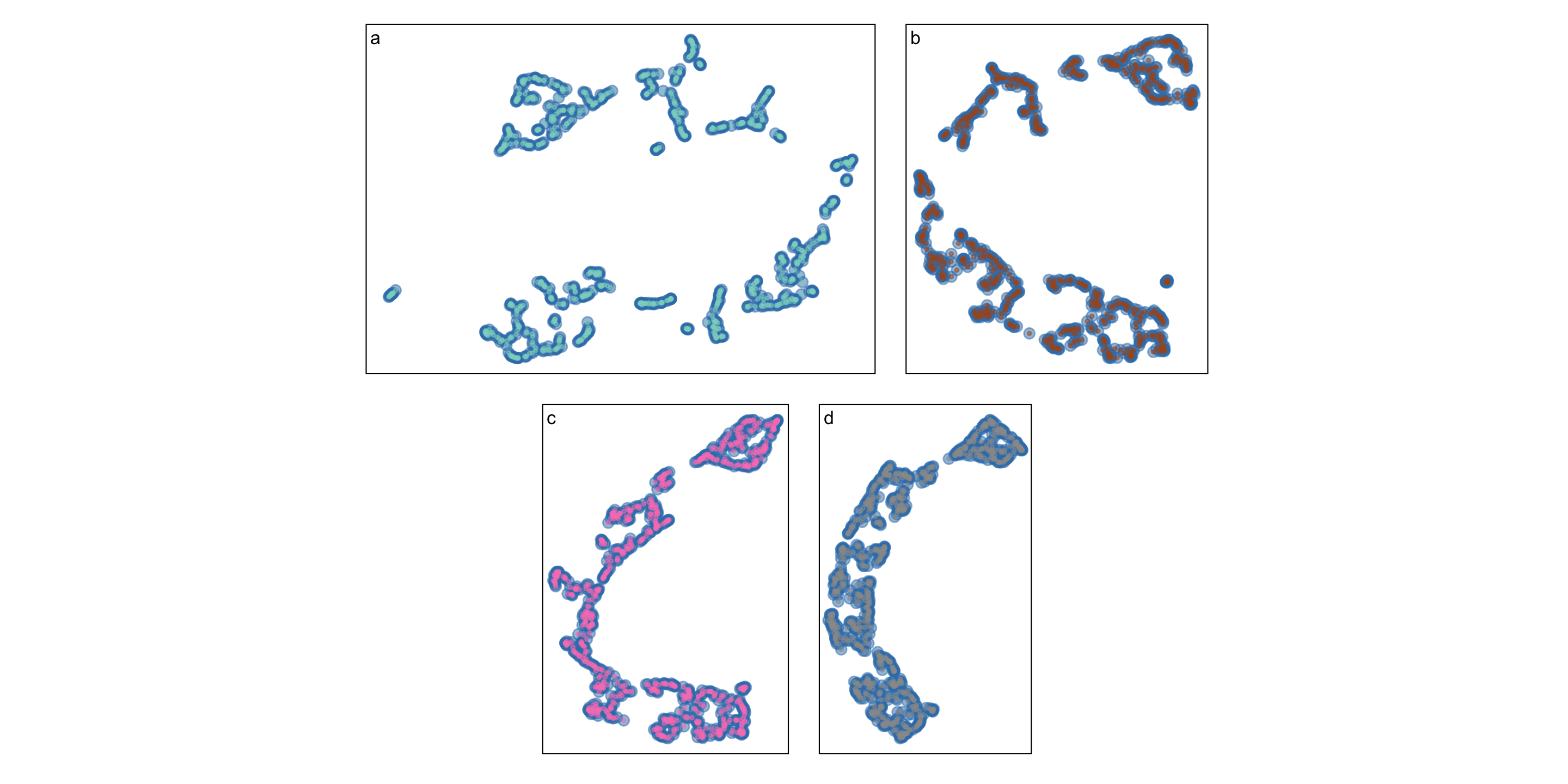
Five different NLDRs give similar but definitely different curves:
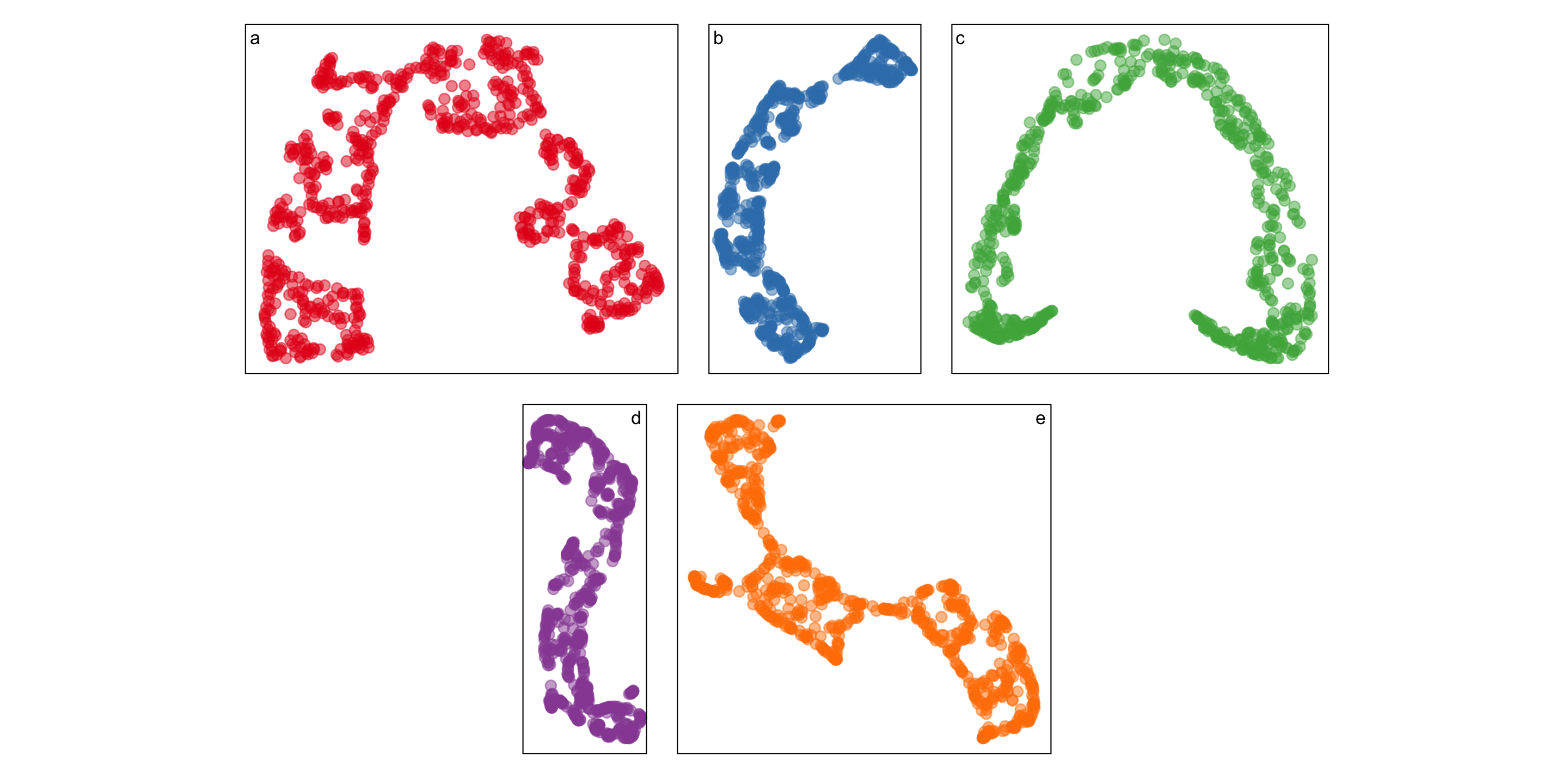
Even the same NLDR looks different
A method to analyse goodness-of-fit
We have developed a method to project the 2D dimension reduction back into higher dimensions where we can visualise discrepancies.
The algorithm has four steps:
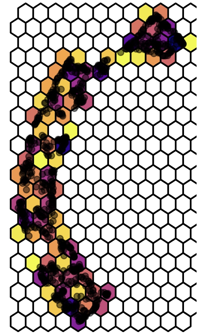
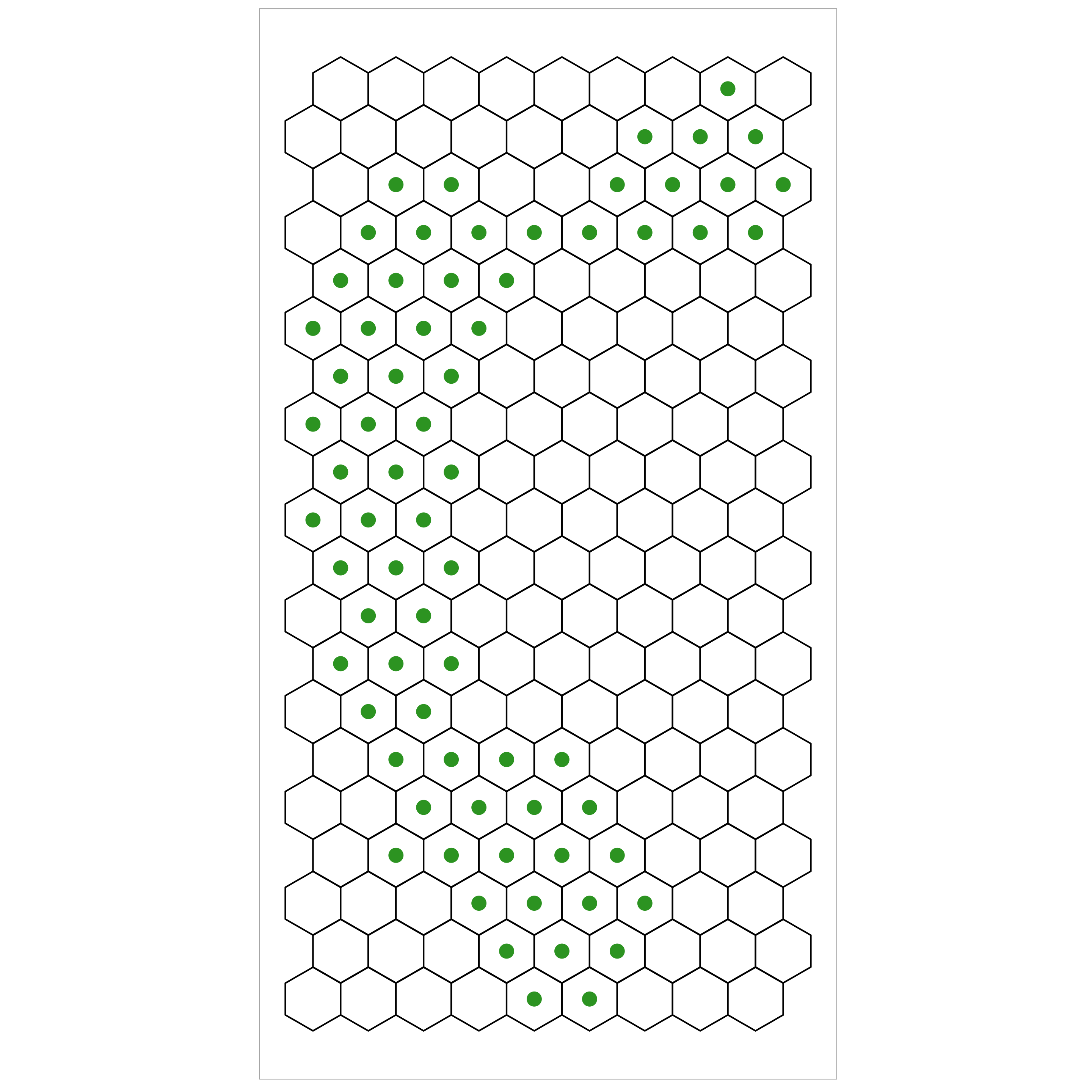
- Parition DR data into hexagonal bins
- Triangulate centroids of these bins to form a 2D manifold
- Map the 2D bins to High-D using the points contained within each bin
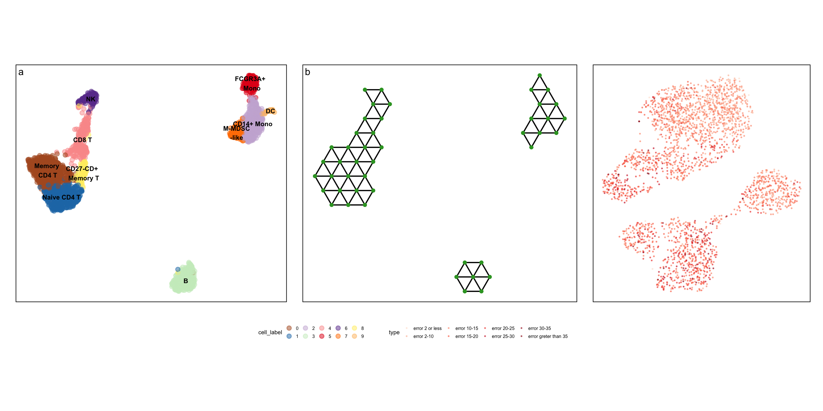
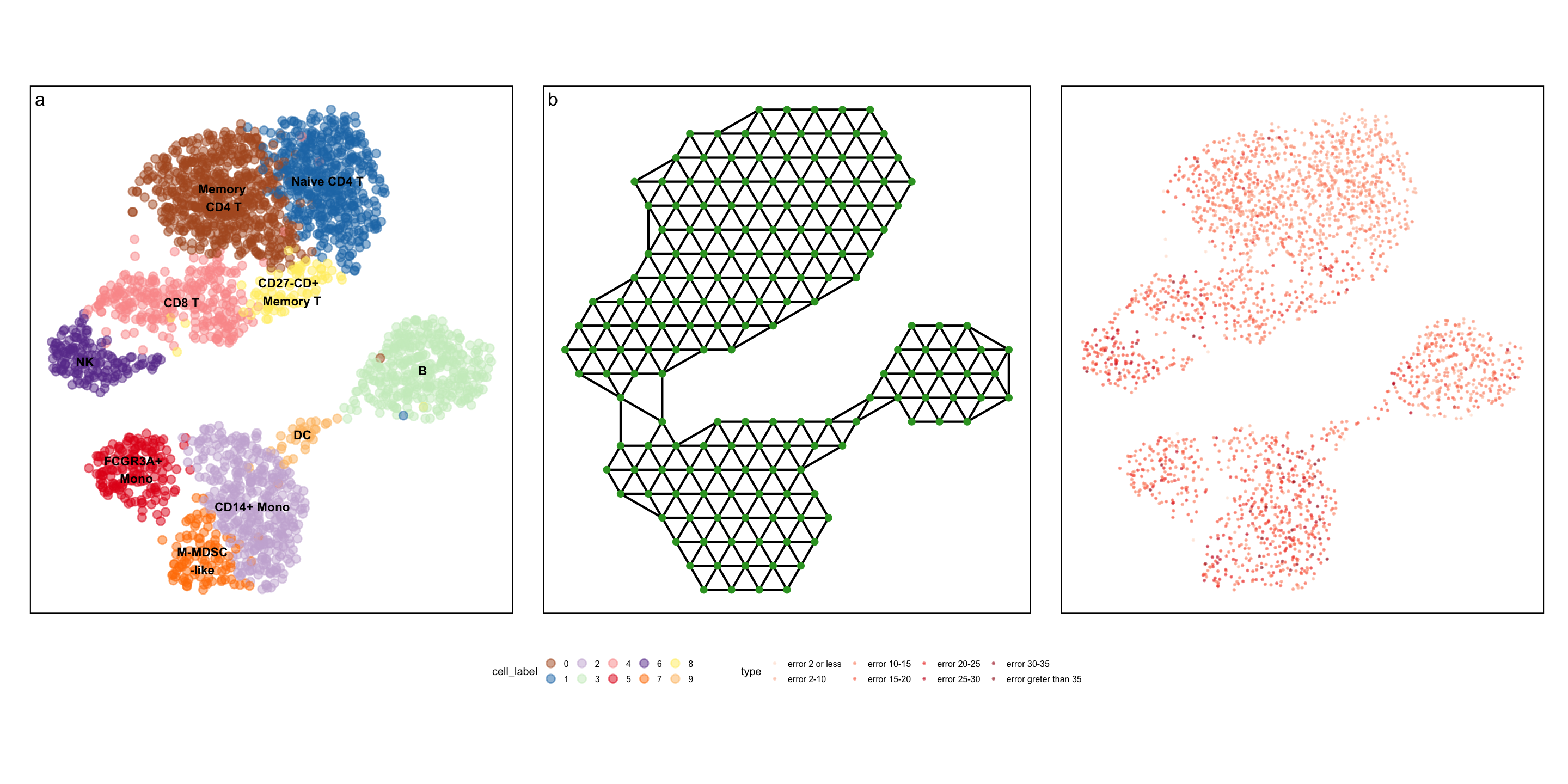
- Measure “model error” and visualise in High-D
Step 1: Partitioning DR data into hexagonal bins
Step 2: Triangulate centroids of these bins
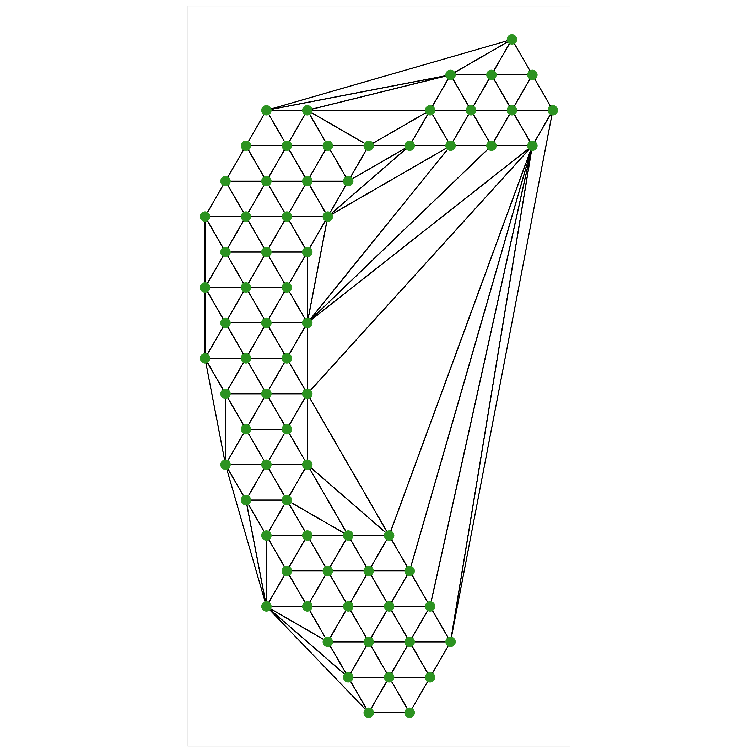
Use Delauney triangulation to create a triangular mesh that is representative of the 2D data.
Beause our hexagons are regular the resulting triangles will be mostly equilateral (which is nice)
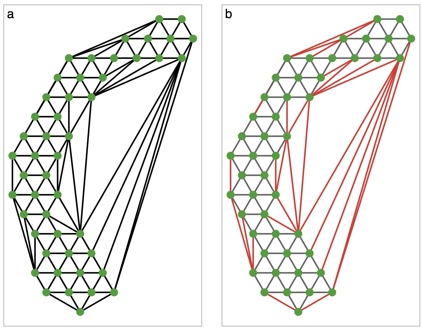
Step 2a: Removing “long” edges
Sometimes triangulation will give edges between two very distant nodes. This is not an accurate representation of the 2D surface, so we trim them off
Step 3: Map from 2D to High-D
Define the function \(f: \mathbb{R}^p \rightarrow \mathbb{R}^2\) which maps the high-D point to it’s NLDR equivalent.
Let the set of all points in a single hexagon \(i\) be denoted by \(\mathbb{H}_i\), with centroid \(\mathcal{h}_i\).
Then, let \(g: \mathbb{R}^2 \rightarrow \mathbb{R}^2\) be a function that maps each point in 2D space to it’s closest centroid.
It follows that \(f(g(x))\) maps the high-D point to the centroid in 2D.
Step 3: Map from 2D to High-D
Define the high-dimension mean of all the points in \(\mathbb{H}_i\) by \(\hat{h}_i\). That is,
\[\hat{h}^{(p)} = \frac{1}{|\mathbb{H}_i|}\sum_{x \in \mathbb{H}_i} \sum_{d = 1}^p x_{\cdot,d}\]
Finally, we choose a function \(v: \mathbb{R}^2 \rightarrow \mathbb{R}^p\) such that \[v(\mathcal{h}_i) = \hat{h}^{(p)}.\]
That is, the function \(v\) maps the 2D centroid to the high-D mean of the points in the hexagon.
Step 3: Map from 2D to High-D
So, \((f \circ g)(x)\) gives the 2D centroid associated with \(x\), and \(v(h_i)\) gives the high-D centroid associated with 2D point \(h_i\).
Thus, \(v(f \circ g)(x)\) gives the high-D centroid associated with the 2D embedding of the point \(x\).
We use this process to define a model of the 2D embedding in high dimensions, allowing us to visualise and compute error.
Step 4: Visualise model fit in High-D
Real-world example: PBMC dataset
Real-world example
Real-world example
Real-world example
Summary
- Dimension reduction is hard
- Maximising variance can create or elongate structures that may not be present in the data
- Visualising in high dimensions using a tour is a way to assess model fit
- This algorithm helps create an easier visualisation for end users

Data science and impact
Don’t let a small amount of data limit your reach
- Data is expensive, we all want more all the time…
- But a “handful” of observations can lead to real change
- At the same time, more data does not always mean more good
- You can’t model your way out of bad data
- But you can model good data badly
Impactful projects rely on good people, good problems and good techniques.
